Altair Reactive Plots
by marimo team
Interactive Altair charts with brush selection and reactive filtering.
About this notebook
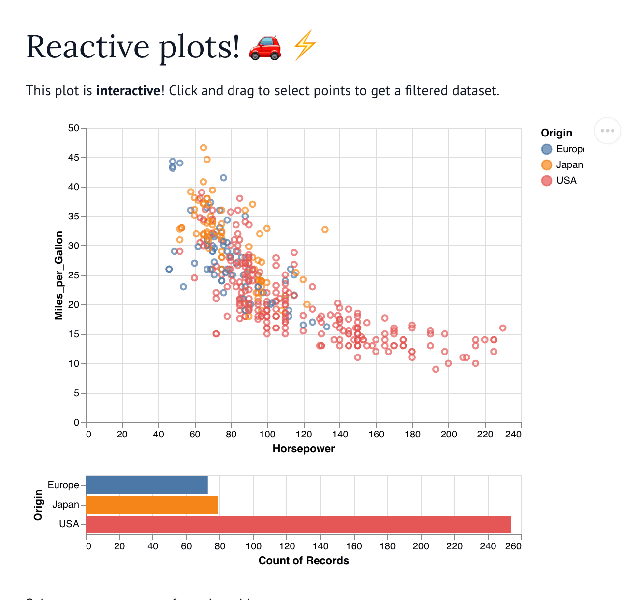
This notebook draws linked Altair charts from the cars dataset. It loads the data with the vega_datasets package. It builds the charts with altair and shows them through marimo. The first chart is a scatter plot of horsepower against miles per gallon. Each point takes a color from the car origin. A bar chart next to it counts cars by origin.
You click and drag on the scatter plot to select a region of points. The bar chart then filters to match your selection. A marimo table below the chart lists the cars you selected. You can pick one or more rows from that table. Two histograms then appear and show the miles per gallon and horsepower for those rows.
The notebook wraps each chart with mo.ui.altair_chart so marimo can read the selection. It calls mo.stop when no rows are selected, so the histograms stay hidden until you choose data. It places the two histograms side by side with mo.hstack.