Drawdata Scatter
by marimo team
Draw scatter data interactively and visualize it with Altair histograms.
About this notebook
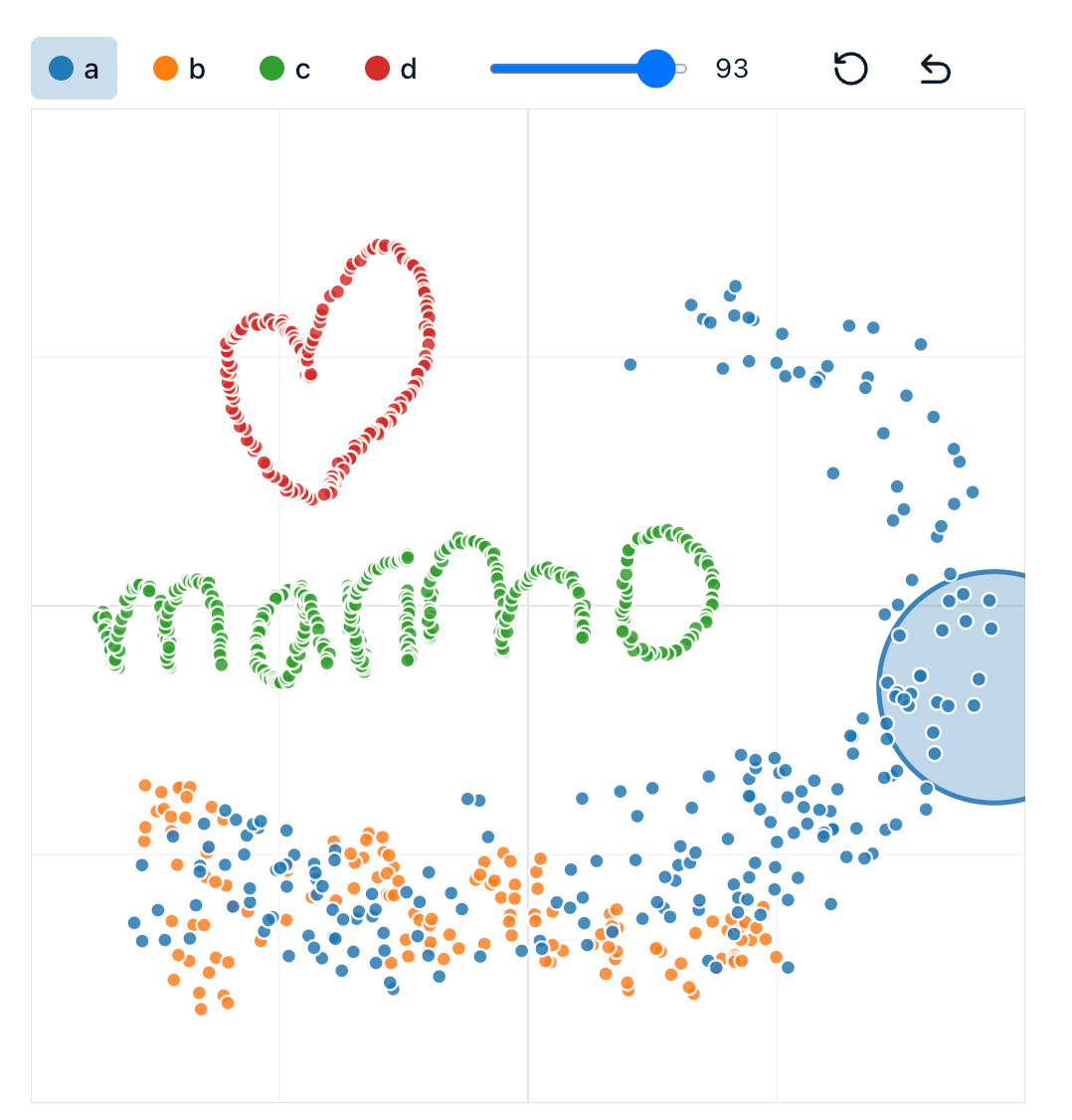
This notebook demonstrates the ScatterWidget from the drawdata library. The widget is a canvas where you draw colored points with your mouse. The notebook reads the drawn points as a pandas DataFrame and plots them with Altair.
The drawing is reactive because marimo wraps the ScatterWidget with mo.ui.anywidget. When you draw points, marimo re-runs the cell that builds the chart. That cell shows the points as a scatter plot with two histograms: the x values along the top and the y values along the right. Each histogram splits its counts by color.
The chart cell reads the drawing through the widget's data_as_pandas property. The x and y axes have fixed domains (0 to 800 and 0 to 500), so the plot does not rescale while you draw. The color column stores color names, and the Altair color scale uses those names as its range. The chart colors therefore match the widget colors.