ChartPuck
by marimo team
Interactive chart editor with draggable control points.
About this notebook
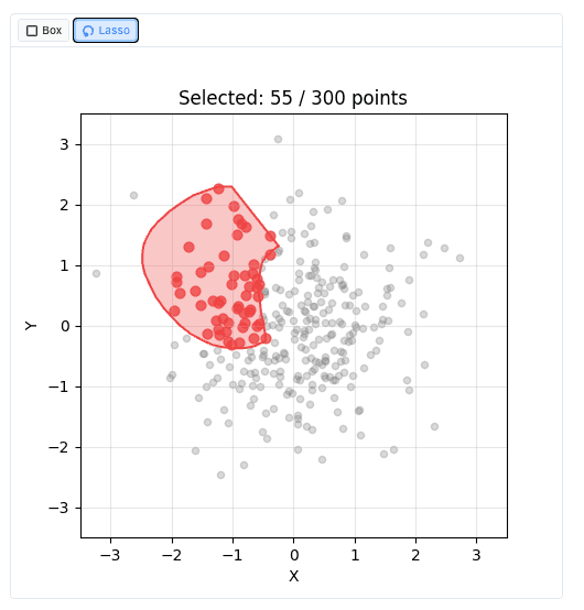
This notebook shows the ChartPuck widget from wigglystuff. It builds matplotlib scatter plots and draggable markers called pucks. The code uses numpy for the point data, scipy for curve interpolation, and scikit-learn for the clustering section. The final section loads the scikit-learn digits dataset and reduces it to two dimensions with PCA.
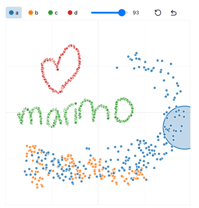
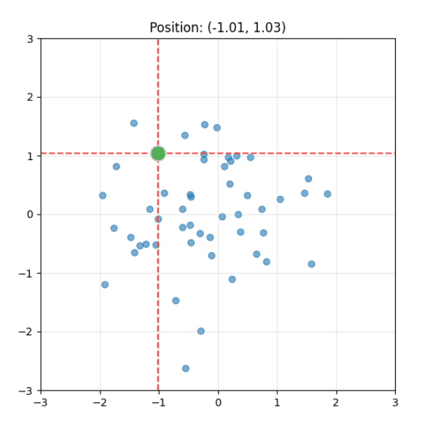
You drag a puck across a chart to set its x and y coordinates. A callout below each chart prints the current position. Some charts hold several pucks, and the closest puck follows your drag. In the spline editor you drag pucks to shape a curve between two fixed anchor points. A slider sets the number of pucks. A dropdown selects the interpolation method, such as CubicSpline, Pchip, Akima, or Linear. In the k-means section you drag ten pucks to move cluster centroids. The chart redraws the decision regions, and a side panel shows the five nearest digit images to each puck.
The k-means demo waits behind a run button, so it loads only after you click. The pucks act as initial centroids, and KMeans runs with max_iter set to 1 to keep your placement. The notebook can export these puck positions as a scikit-learn KMeans estimator through export_kmeans().